
[ad_1]
A chart is a graphical representation of data that helps your audience to understand your information easily; charts make comparisons in your data and analyze the trends or patterns in data sets. Charts are often used in business, especially in marketing, which allows individuals to make their points more convincing to their audience. Bar Charts are often used in business because they are so easy to understand, while the Box and Whisker Chart are often used in statistical analysis. The Box and Whisker Chart shows the distribution of data into quartiles, highlighting the mean and outliers.
How to create a Box and Whisker Chart in Excel
Follow the steps below to create a Box and Whisker Chart in Microsoft Excel:
- Create a table or use an existing table.
- Highlight the data in your table.
- Go to the Insert tab in the Charts group, and click the See All Charts arrow.
- Click the All Charts tab.
- On the left pane, click Box and Whiskers.
- The chart is inserted into the spreadsheet.
Launch Excel.
Create a table or use an existing table.
Highlight the data in your table.
![]()
On the Insert tab in the Charts group, click the See All Charts arrow.
An Insert Chart dialog box will open.

On the left pane, click the Box and Whiskers Chart; You will see a preview of the chart displayed on the right.
Then click OK.
The Chart is inserted into the spreadsheet.

Where you see Chart Title, double click on it and type a title.

If you notice that the Legend of the chart is missing, and you want it to be in the chart, click the chart and click the Chart Elements button and check the Legend checkbox from its menu.
The Legend will appear on the chart. The Legend is an area that describes each part of the chart.

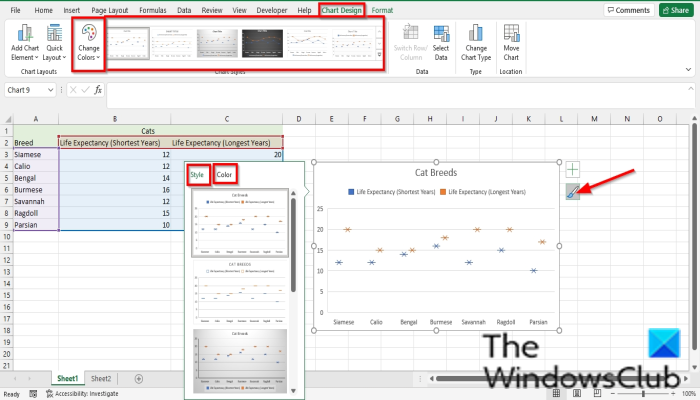
If you want to change the style and color patterns of the chart, click the Chart styles button (ensure you click the chart first.)
On the Styles tab, choose a style from its menu.
On the Color tab, choose a color pattern from its menu. Depending on the color pattern you choose, the legend color will change on your chart.
You can also change the Chart Style and Color pattern on the Chart Design tab.
Choose a Chart Style from the Chart Styles Gallery.
Choose a color pattern from the Change Colors menu.

To read the chart, put your cursor over the pointers in the chart, and you will see the information in the table displayed.
Read: How to export data from Access to Excel
Is a table a Chart?
Tables and Charts are completely different; a table is a representation of data in rows and columns, while a chart is a graphical representation of data. To create a chart in Excel, you must create a table. Charts make the data displayed in the table more easer to understand for your audience.
Read: How to use the PROPER function in Excel
What is chart type?
Chart Types are categories of charts that you can use for your presentation, the most popular charts that are often used by individuals are Pie charts, Bar charts, Line charts, Column charts, Area charts, and Scatter charts.
We hope this tutorial helps you understand how to create a Box and Whisker Chart in Excel; if you have questions about the tutorial, let us know in the comments.
Now read: How to use Slicers in Microsoft Excel to efficiently filter data.
[ad_2]
Source link
www.thewindowsclub.com