
[ad_1]
Microsoft Excel is a program that is used by many to visualize and analyze data. Excel is also known for creating charts. Charts are a graphical representation of data. In this tutorial, we will discuss how to create a mirror chart. A mirror chart compares data of two column series.

How to create a mirror chart in Excel
To create a bi-directional mirror bar chart in Excel, you will have to start with the Stacked Bar In the 2-D Bar section. Here are the detailed steps to be followed.
Launch Excel.
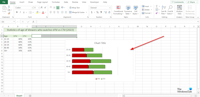
Prepare your data. See the photo above.
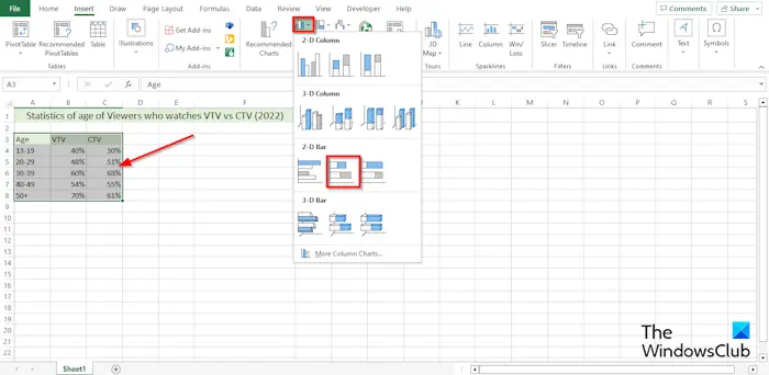
Select the data range, click the Insert tab, then click the Insert Column or Bar button in the Chart group.
In the 2-D Bar section, select the choose the Stacked Bar option from the menu.
A Bar Chart is inserted into the spreadsheet.
Now we are going to position the horizontal axis.
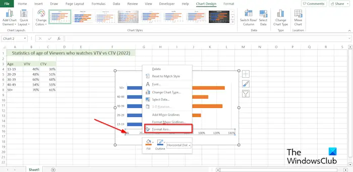
Right-click the horizontal axis and select Format Axis from the menu.
A Format Axis pane will appear on the right.
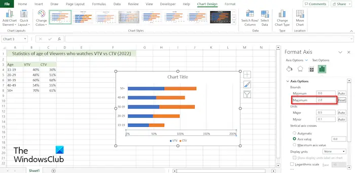
Under the Axis Options section, under the Bounds, change the Maximum to 2.
Now we are going to hide the horizontal axis.
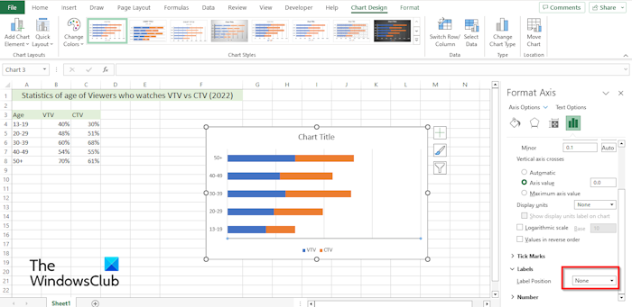
In the Label section, in the Label Position drop-down list, choose None.
Close the Format Axis pane.
Now we are going to format the vertical axis.
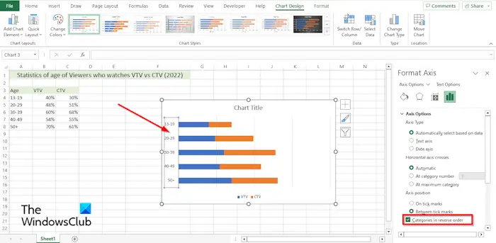
Right-click the vertical axis and select Format Axis from the menu.
The Format Axis Pane will open.
Under Axis Options, under Axis Position, check the check box for Categories in reverse order.
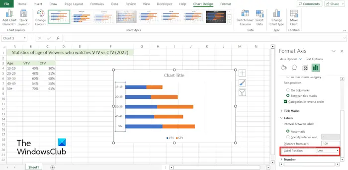
Under the Label section, click the Label Position drop-down and select Low.
Close the Format Axis pane.
Now we are going to format the thickness of the data series.
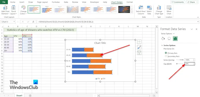
Right-click the data series on the chart and select Format Data Series from the menu.
The Format Data Series Pane will open on the right.
Under Series Options, change the Gap Width to 50%.
Now we are going to change the shape of the data series.
On the Insert tab, click the Illustration button, click the Shape button, then select the shape you want.
Draw the shape on the spreadsheet.
Change the color of the shape.
Now we are going to copy and paste the shape on the chart.
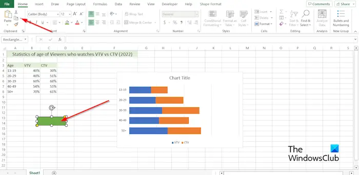
Select the shape, then click the copy button on the Home tab in the Clipboard group.
Then select the series on the chart, then click the Paste button in the Clipboard group.
The series you have selected will take the form of the shape you have inserted into the spreadsheet.
Do the same steps for the other series on the chart.
How do I change a bar graph from vertical to horizontal in Excel?
- Click on the data series that you want to plot on a different axis.
- The Chart Design tab is now displayed along with the Format tab.
- On the Chart Design tab in the Data group, click the Row/Column button.
READ: How to create a Chart with Crayon effect in Excel
How do you flip a chart left to right in Excel?
- Right-click any of the axis on the chart and select Format axis on the menu.
- A Format Axis pane will open.
- Under the Axis Options, in the Axis Position section, check the checkbox for Categories in reverse order.
- Excel will reverse the plot order.
READ: How to create a Run Chart in Excel.
[ad_2]
Source link
www.thewindowsclub.com